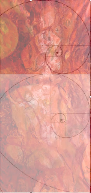
Right now, the upward arch mid-way up the panel bothers me a bit...the division of proportion doesn't feel right; it is too central. I may add a subtle echo of that arch a bit higher up, closer to the golden proportion from the bottom, about 3/5th or so. That should help life the eye and add to the tier structure at the same time. Will repost as I go.
I may also add some hot little hits of Mexican pink here and there. I like the analogous rocking of color (and values) back and forth. Could then add micro hits of green to introduce more optical simultaneous contrast.
 |
Superimposed golden spirals
to check possible new alignments.
|
None of this phi proportion 1.1618 "golden" ration business is an absolute mandate for me, per se, but it is fun to play with the geometry since it frequently leads to a stronger sense of design and compositional unity. I have employed it often in my past work. Nature seems to love such geometry and so, alas, do we aesthetically. See: http://www.goldennumber.net.
 |
Again, perhaps more clearly,
an idea of where the golden section would place
a new horizontal accent.
|
The hues I committed to, mostly on emotional grounds, remind me in retrospect of Mesoamerican cochineal red often used in weaving from my time living in Oaxaca, Mexico. The colorant is from the cochineal beetle that nests on cactus that is gathered meticulously, then ground, cooked, etc. The same colorant is used in cosmetics.


No comments:
Post a Comment